A design system helping the R3 engineers to develop blockchain applications better, faster, together.
Client
R3
Industries
Fintech, Blockchain
Year
2020/2021
Creating the R3 tooling design system
Client
R3
Industries
Fintech, Blockchain
Year
2020/2021
The challenge
Building a design system for non-designers
Over 400 people work at R3. The majority of them are developers. We had to design a system of guidelines, design and architecture principles, components, patterns, and processes that satisfy the needs of the R3’s developers. Our aim was to enable team collaboration, led by the same standards and principles. We needed to create a cross-disciplinary platform that streamlines the development process for non-design users.
And last but not least, make the development process pleasant and fun.


Overview
Main goals
- Functional, well structured, and logically organised interface
- UI that is consistent throughout different projects and applications
- Accessible and easy to use applications
- Fast and frictionless development
- Components behaving well in high-risk scenarios
My role
- Project management (UX + FE)
- Leading and mentoring UX team
- Hands-on UX designing
- Documenting
- Communicating with the client
- Kudos 👏 to Tsvete Asenova, who was an outstanding contributor to this project.
The process
1
Research and analyse
Analyse and understand R3’s needs by working closely with the R3 team. Examine, test, and map out existing solutions, websites, and tools to discover tendencies and discrepancies.
2
Define rules and standards
Define accessibility, scalability and consistency
standards. Set clear and logical structure, semantic naming conventions, and
development standards. Integrate R3’s visual and brand identity.
3
Create the inventory list
Create a meaningful final list of components following the Atomic Design Methodology. Structuring the system by starting from fundamental building blocks and working up from there.
4
Design the UX and UI
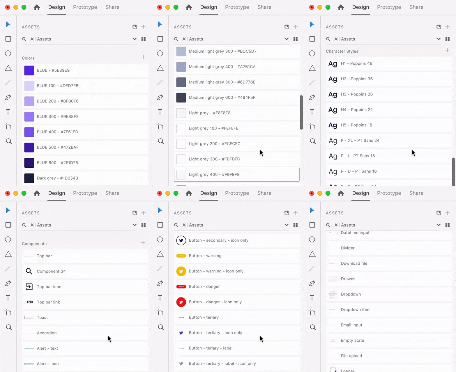
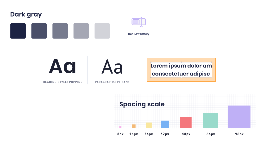
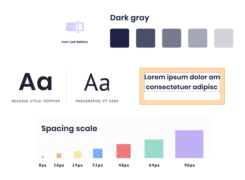
Design everything - from A to Z - grids, layouts, typography, components and elements, their states and variations. Create a reusable and scalable GUI kit. Design a user-friendly SDK (showcase website).
5
Develop and test
The front-end team developed a React library according to the highest industry standards. They built a software development kit (SDK) that allows developers to create of quality-guaranteed products.
6
Document
Help developers understand and use the design system in the best way possible through detailed documentation on concepts, principles, standards, and component usage.

The approach
Structuring components the Atomic way
The system follows Brad Frost’s Atomic Design methodology with some structural modifications. The elements and components are divided into four general categories: Environment, Atoms, Cells, and Organisms.

Environment
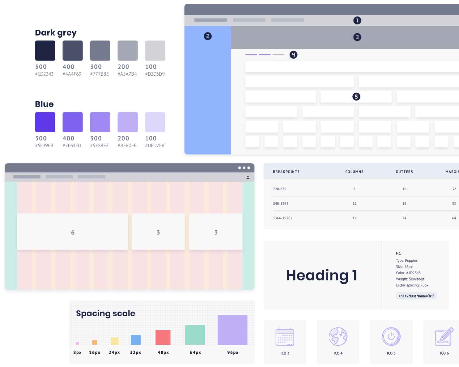
The Environment contains the basic principles that shape the appearance of the system and the applications built with it.
- Grid and Layout
- Size and Spacing
- Colour
- Typography
- Icons
- Pictograms


Atoms
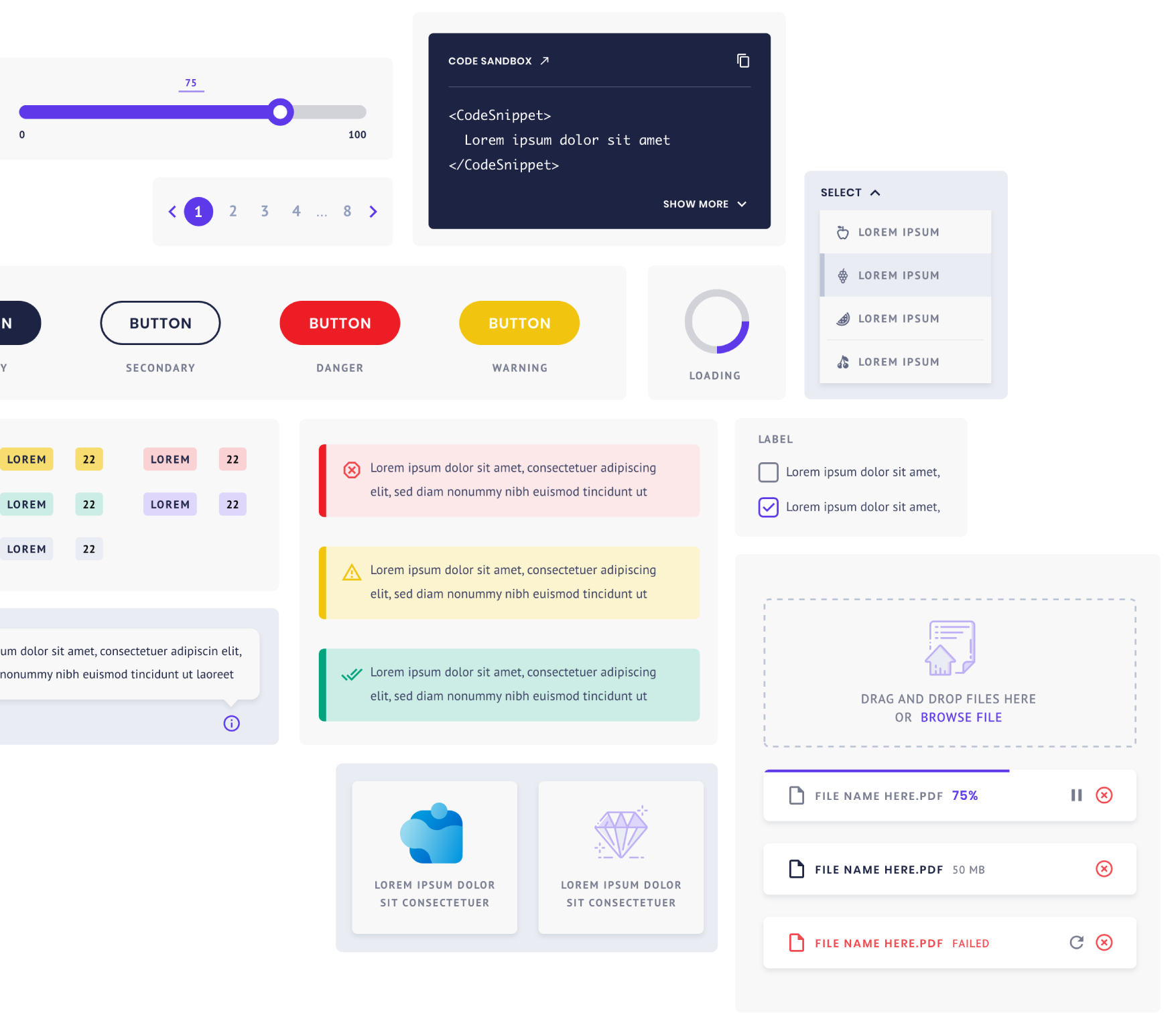
The Atoms are the indivisible, fundamental building blocks of the system. An atom could be a basic UI control like a Button, Link, Form input, Tab, etc. We've designed over 40 different atom components within the system.


Cells
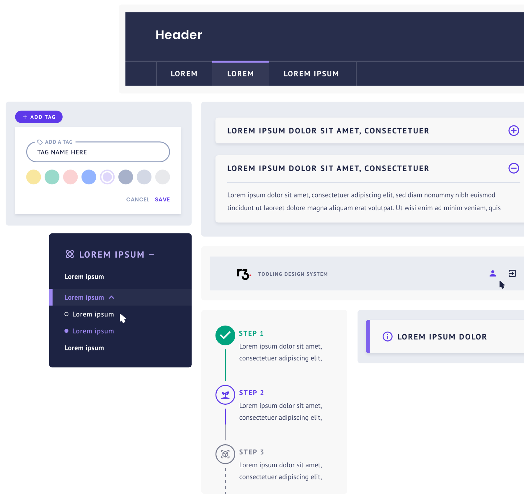
Cells are more complex components constructed by different Atoms functioning together as units. Such components are the Top navigation, Left navigation, Breadcrumbs, Page header, Bottom bar, Modal boxes, etc.


Organisms
The lower-level components from the Atoms and Cells sections, following the principles set in the Environment section, create the page-level templates called Organisms. These layouts could be simple as a Login page or as complex as a Dashboard.

SDK and GUI
Practical and user-friendly library
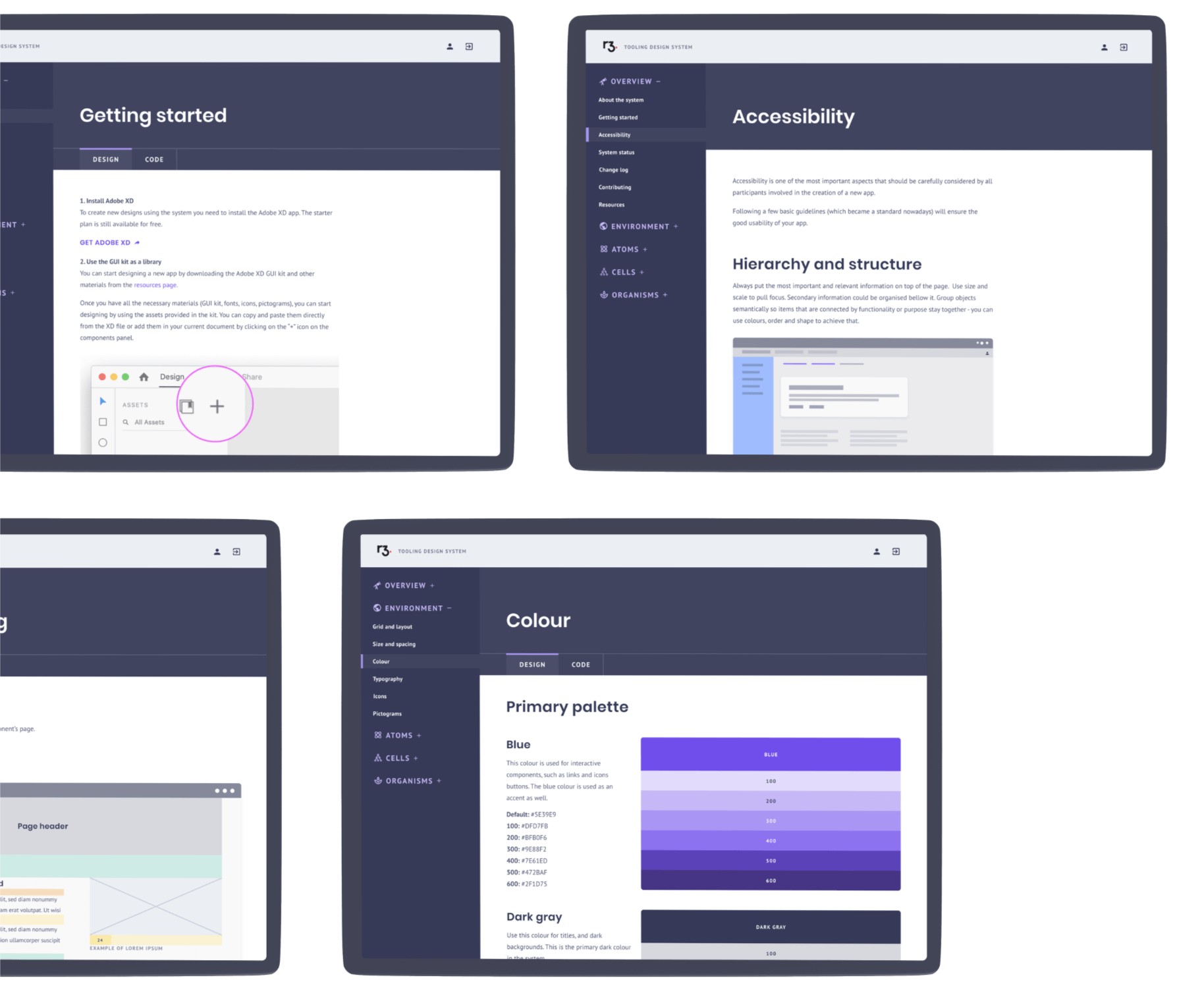
We have created an SDK site which allows users to discover the full potential of the design system.
- Installation instructions for both design and code materials and tools speed up the process
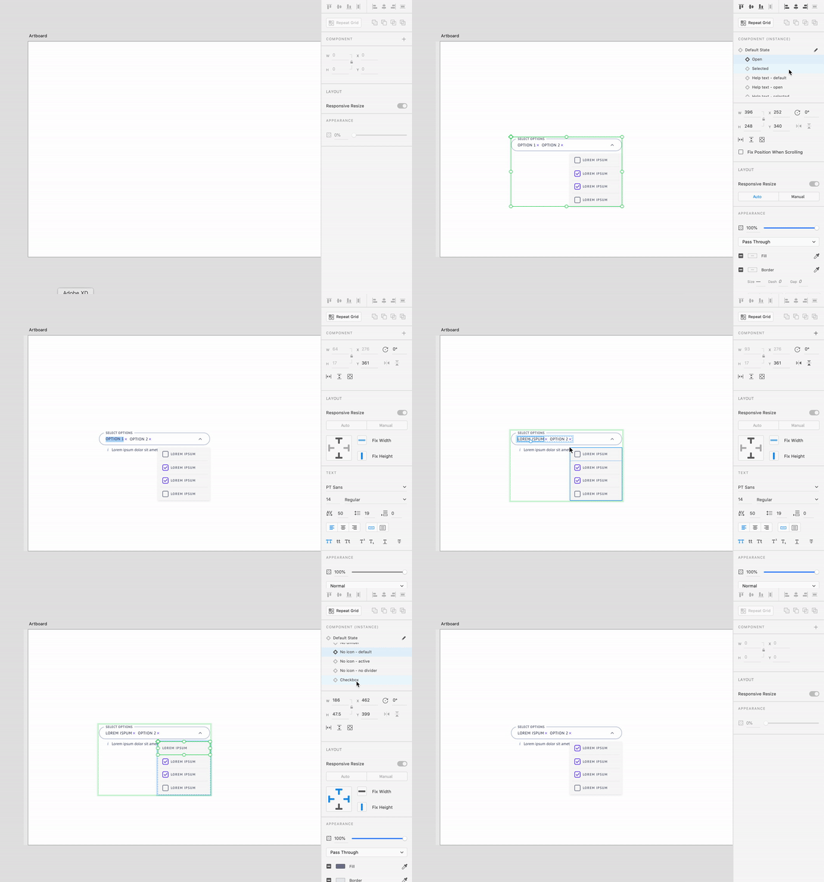
- An interactive sandbox allows users to discover all possible variations of a component
- Simple illustrated instructions help understand the behaviour and usage of the particular element
Watch the video to see how the library works. 👆
The finale
Results
- 💸 Hundreds of thousands $ saved by eliminating duplicate UI work
- ⏰ Increased speed of development via reusable, scalable components
- 🎨 Reduced risk of design debt accumulation due to set rules and principles
- 🖖 Improved collaboration between teams, knowledge sharing, and breaking silos
- 💻 Ensured consistency throughout all apps, enforcing R3’s brand and identity